
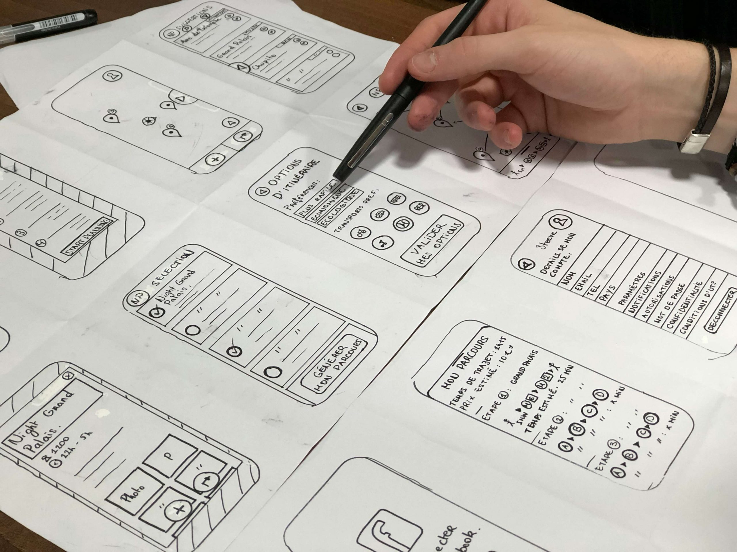
When should startups invest in UX design is one of the most misunderstood questions in early stage product building. After more than eleven years working as a senior UI UX designer across early stage startups, funded SaaS products, and scaling platforms, I can say this clearly. Most startups wait too long. And when they finally invest, they are trying to fix damage instead of building momentum.
UX for startups is not about making something look polished. It is about reducing uncertainty in product decisions and accelerating validated learning. The business impact of UX shows up earlier than most founders expect.
When Should Startups Invest in UX Design Before or After Product Market Fit
The common belief is that UX comes after product market fit. That is usually a mistake.
When should startups invest in UX design if they are still searching for product market fit The answer is earlier than comfort allows.
In early stage products, UX is not decoration. It is a discovery tool. It clarifies assumptions, reveals friction, and exposes gaps in product strategy UX. Poor UX masks whether users truly find value or are simply confused.
I have seen startups misinterpret churn as a market problem when it was actually a usability problem. Without proper UX thinking, feedback becomes distorted.
When Should Startups Invest in UX Design During MVP Stage
Many founders believe that MVP means minimal UX. That assumption often backfires.
When should startups invest in UX design during MVP development The answer is at the moment the first real user touches the product.
An MVP should test value, not tolerance. If early users struggle to understand the flow, founders may incorrectly assume the core idea lacks demand.
UX for startups at the MVP stage is about clarity, not complexity. It ensures that feedback reflects product value rather than usability confusion.
Without intentional UX, early data is unreliable.
When Should Startups Invest in UX Design to Avoid Expensive Rework
From experience, the cost of late UX investment is significantly higher than early integration.
When should startups invest in UX design if engineering is already in progress The answer is immediately.
Retrofitting UX onto a built product creates structural limitations. Navigation patterns become fixed. Information architecture hardens. Technical constraints limit redesign flexibility.
I have worked on products where foundational UX mistakes required near complete rebuilds. The cost was not only financial. It slowed momentum and drained team confidence.
Early UX investment protects product strategy UX from expensive pivots later.
When Should Startups Invest in UX Design for Business Impact
UX business impact is often underestimated in early stage companies.
When should startups invest in UX design if they are focused on growth metrics The answer is before scaling traffic or paid acquisition.
Driving traffic to a poorly structured product compounds losses. Low activation rates, poor onboarding, and unclear value propositions erode marketing efficiency.
Strong UX increases activation, retention, and conversion simultaneously. It ensures that growth efforts amplify results instead of exposing weaknesses.
From a business perspective, UX is a leverage point. It improves the efficiency of every acquisition dollar spent.
When Should Startups Invest in UX Design to Reduce Churn
Retention issues are rarely solved by adding features. They are often rooted in experience friction.
When should startups invest in UX design if churn is rising The answer is before adding more functionality.
Reduce churn UX thinking focuses on clarity, guidance, and progressive complexity. Users leave not only because value is missing, but because value is hard to access.
In several startup environments I have worked in, retention improved significantly after simplifying onboarding and refining core workflows, without introducing new features.
Churn is often a signal of experience misalignment rather than feature gaps.
When Should Startups Invest in UX Design to Strengthen Product Strategy UX
Product strategy UX is not separate from business strategy. It is embedded within it.
When should startups invest in UX design if they are refining positioning or pricing The answer is during strategic shifts, not after.
UX reveals how users interpret product positioning. It clarifies whether pricing tiers align with perceived value. It exposes whether messaging matches interaction reality.
If strategy changes but UX does not evolve, inconsistency emerges. Users feel the disconnect even if they cannot articulate it.
UX acts as a bridge between strategic intention and user perception.
One of the most damaging UX mistakes killing your conversion rate is designing based on assumptions rather than observed behavior.
Internal teams often know the product too well. That familiarity creates blind spots. What feels obvious internally feels confusing externally.
As a senior designer, the first thing I look for is whether the interface aligns with how users actually think. Not how the team wants them to think.
When UX decisions are driven by internal logic instead of user mental models, conversion friction becomes inevitable.
UX Mistakes Killing Your Conversion Rate Through Unclear Value Communication
A common UX mistake killing your conversion rate is failing to communicate value immediately.
Users do not arrive to explore. They arrive to assess relevance. If the interface does not clearly answer what this is and why it matters within seconds, users disengage.
Design that prioritizes cleverness over clarity often performs poorly. Strong UX is explicit. It reduces interpretation.
When value is vague, users feel uncertain. Uncertainty stops decisions.
UX Mistakes Killing Your Conversion Rate Due to Poor Interaction Feedback
Feedback is one of the most underestimated elements in UX.
Many UX mistakes killing your conversion rate occur because the system does not clearly respond to user actions. Buttons feel inactive. Forms submit without confirmation. Errors appear without explanation.
From experience, lack of feedback creates anxiety. Users wonder whether something worked or whether they made a mistake.
Every interaction should reassure users that they are progressing correctly. Silence is not neutral. Silence feels broken.
UX Mistakes Killing Your Conversion Rate in Information Hierarchy
Hierarchy determines what users notice and what they ignore.
A critical UX mistake killing your conversion rate is treating all content as equally important. When everything competes for attention, nothing wins.
Users scan pages looking for relevance and direction. If headings, CTAs, and supporting content are not clearly structured, users miss the conversion path entirely.
Good UX design guides attention deliberately. It does not leave interpretation to chance.
UX Mistakes Killing Your Conversion Rate Through Excessive Cognitive Load
Cognitive load is one of the biggest silent conversion killers.
A UX mistake killing your conversion rate is forcing users to process too many options, messages, or steps at once. Complexity slows decision making.
As a senior UI UX designer, I have seen conversion rates improve simply by removing elements rather than adding persuasion.
Less choice often leads to more action.
When users feel mentally taxed, they postpone decisions. Postponement is indistinguishable from abandonment.
UX Mistakes Killing Your Conversion Rate in Forms and Micro Moments
Forms are where UX mistakes become expensive.
Many UX mistakes killing your conversion rate appear in small moments like unclear labels, unnecessary fields, vague validation messages, or poor spacing.
Users do not complain about forms. They simply stop filling them out.
From experience, optimizing form UX often produces immediate conversion improvements because it removes the final barrier to action.
Micro moments matter because they occur at decision points.
UX Mistakes Killing Your Conversion Rate by Increasing Perceived Risk
Every conversion involves perceived risk. UX should reduce it, not amplify it.
A frequent UX mistake killing your conversion rate is neglecting reassurance elements such as clarity, consistency, and predictability.
Inconsistent layouts, unclear pricing logic, or missing confirmation cues make users question whether proceeding is safe.
Good UX reduces anxiety by being transparent. When users feel confident, they act.
When UX introduces doubt, they hesitate.
UX Mistakes Killing Your Conversion Rate and Long Term Reduce Churn UX Impact
Many teams focus on conversion without considering what happens after.
Some UX mistakes killing your conversion rate also create churn later by setting unrealistic expectations. Overpromising through design might increase clicks but damages trust.
Reduce churn UX starts at the first interaction. Honest UX aligns expectations with reality.
If users feel misled, conversion metrics may look good temporarily, but retention suffers.
Sustainable conversion and retention are connected.
UX Mistakes Killing Your Conversion Rate Without a Proper UX Audit
Most conversion fixes fail because they are not grounded in evidence.
A UX mistake killing your conversion rate is skipping a proper UX audit and relying on opinions or isolated metrics.
A real UX audit examines user behavior, hesitation points, flow breakdowns, and decision friction. It looks beyond surface level analytics.
In my experience, teams are often surprised by what audits reveal. What they assumed was a content problem turns out to be a navigation issue. What they blamed on traffic quality turns out to be UX clarity.
Without an audit, teams fix symptoms, not causes.
UX Mistakes Killing Your Conversion Rate Due to Internal Bias
One of the hardest UX mistakes to correct is internal bias.
When UX reflects internal structure instead of user logic, conversion suffers. Navigation mirrors departments. Labels reflect internal terminology. Features dictate layout.
Users do not share internal context. They approach the experience with fresh eyes.
Senior designers learn to design against organizational bias. That is where meaningful conversion improvements come from.
One of the biggest misconceptions I see is the belief that good looking interfaces automatically perform well. They do not.
When a website not converting, the issue is usually not color palettes or typography. It is cognitive load, unclear intent, broken hierarchy, or missing feedback loops.
UX design is not how something looks. It is how clearly a user understands what to do next and why they should do it.
I have reviewed dozens of websites where every component followed modern design trends, yet users hesitated, stalled, or abandoned entirely. The reason was simple. The experience demanded too much thinking.
Website Not Converting Due to Misaligned User Intent
A website not converting often fails at the very first step, which is intent matching.
Users arrive with a specific question, problem, or goal. If the page does not immediately acknowledge that intent, users feel lost even if the design is attractive.
As a senior designer, one of the first things I look for during a UX audit is intent clarity. Can users immediately tell that they are in the right place. Or do they have to interpret marketing language to understand relevance.
When intent is unclear, users hesitate. Hesitation kills conversion.
Website Not Converting Because of UX Problems Hidden in Plain Sight
Most UX problems are subtle. That is why they persist.
A website not converting often suffers from issues like unclear call to action hierarchy, inconsistent interaction patterns, or content that explains features but not outcomes.
These problems rarely trigger complaints. Users do not say what is wrong. They simply leave.
From experience, the most damaging UX problems are the ones that feel minor internally but create cumulative friction externally. Extra steps. Vague labels. Competing buttons. Unclear system states.
Conversion drops not because of one big failure, but because of many small ones.
Website Not Converting When Decision Making Feels Risky
Every conversion is a decision. Decisions require confidence.
If your website not converting, ask whether the experience reduces or increases perceived risk.
Unclear pricing. Missing proof. Ambiguous language. Inconsistent visuals. These all signal uncertainty.
As designers, we often focus on persuasion but forget reassurance. Users need to feel safe proceeding. That safety comes from clarity, consistency, and predictable interactions.
When users feel uncertain, they delay. Delay leads to abandonment.
Website Not Converting Due to Poor Information Hierarchy
Hierarchy is one of the most overlooked aspects of UX.
When a website not converting, it is often because everything looks equally important. Headlines compete with subheadings. CTAs compete with navigation. Supporting content competes with primary messages.
Users do not read websites. They scan for relevance. If the hierarchy does not guide attention intentionally, users miss what matters.
In UX audits, I often find that the right content exists but is buried under visual noise. Good conversion focused UX design is ruthless about prioritization.
When Should Startups Invest in UX Design Without Full Time Designers
Early stage startups often hesitate because they cannot hire full time design teams.
When should startups invest in UX design if resources are limited The answer is as soon as product decisions affect real users.
Investment does not always mean a large team. It can begin with structured user research, defined design systems, or a focused UX audit.
The critical shift is moving from reactive interface decisions to intentional experience design.
Startups that treat UX as a core function from the beginning build more resilient products.
Micro interactions rarely get discussed in conversion conversations, yet they matter deeply.
When a website not converting, friction often appears in form interactions, hover states, error handling, or loading feedback.
Users notice when something feels off. A delayed response. A vague error. A button that does not feel clickable. These moments erode trust.
As a senior UI UX designer, I pay close attention to how the interface responds to user actions. Feedback is not decoration. It is communication.
Lack of feedback feels like a broken promise.
“User-centred design is a method of turning ideas into value, of linking creativity and innovation and achieving outcomes that are good for business, people and the planet.”
Mike Anderson
Managing Director, Bentocase
When Should Startups Invest in UX Design Compared to Engineering
A common internal tension exists between engineering velocity and UX depth.
When should startups invest in UX design relative to development cycles The answer is alongside engineering, not after.
Designing in parallel with development ensures that interaction flows, edge cases, and error states are considered early. It reduces back and forth revisions.
In my experience, collaboration between product, engineering, and UX early in the cycle reduces delays later.
UX is not a slowing force. It is a structuring force.
When Should Startups Invest in UX Design for Long Term Scalability
Scalability is not only about infrastructure. It is about cognitive scalability.
When should startups invest in UX design if they anticipate rapid growth The answer is before complexity multiplies.
As products expand, feature density increases. Without intentional UX architecture, interfaces become crowded and confusing.
Early UX systems create consistency frameworks that scale with the product. Design systems, interaction standards, and navigation logic prevent fragmentation.
Startups that delay UX investment often struggle to unify the experience later.
Low conversion rate is often blamed on visual appeal. In reality, visual design is rarely the root cause.
Most UX mistakes killing your conversion rate are structural, not aesthetic. They involve clarity, feedback, hierarchy, and flow.
A website not converting usually has the right ingredients but the wrong execution.
Good UX does not shout. It guides.
Final Perspective from a Senior UI UX Designer
After eleven years working closely with startup founders and product teams, one pattern remains clear.
When should startups invest in UX design The honest answer is earlier than they think and more intentionally than they expect.
UX for startups is not a cosmetic upgrade. It is a decision framework that reduces risk, accelerates validation, and strengthens business impact.
If startups treat UX as optional, they often misinterpret user behavior and make flawed strategic decisions. If they treat UX as foundational, they build products that learn faster and scale more sustainably.
UX is not a finishing touch. It is structural.
After years of diagnosing conversion problems, this pattern remains consistent.
UX mistakes killing your conversion rate are not dramatic. They are quiet. They accumulate.
Users do not leave because one thing is wrong. They leave because too many small things feel off.
If your website not converting despite looking good, do not assume the problem is traffic, pricing, or messaging alone. Look at how users experience the journey moment by moment.
Conversion lives in those moments.