Solara, an open-source web development framework, empowers developers to create scalable, high-quality web applications using pure Python, prioritizing ease of use and maintainability.
Context
I collaborated with engineers to design and ship web documentation and an end-to-end marketing site.
Through this project, I developed a consistent visual identity across all products, leveraging the inherent association of our name “Solar-a” with space and warm colors. This distinguishes us in the web app development landscape, typically dominated by cold or neutral color schemes.
As a result, we acquired 1k+ new individual users and several enterprise users in Q4, 2024, laying the path for a seed round of funding.
Details
Time Frame:
Jan 24 – Apr 24
Role:
UI/UX Designer, Usability Researcher, UXW
Involvement:
Visual Design, Interaction Design, Prototyping,
UX Writing
Problem
Currently, the landing pages have low conversion rates, hindering user acquisition and eroding user trust.
Our marketing site needs to communicate our value proposition more effectively and generate more leads
Solara's Growth Stunted by Outdated Website
Most users come from Github and rarely use our website.
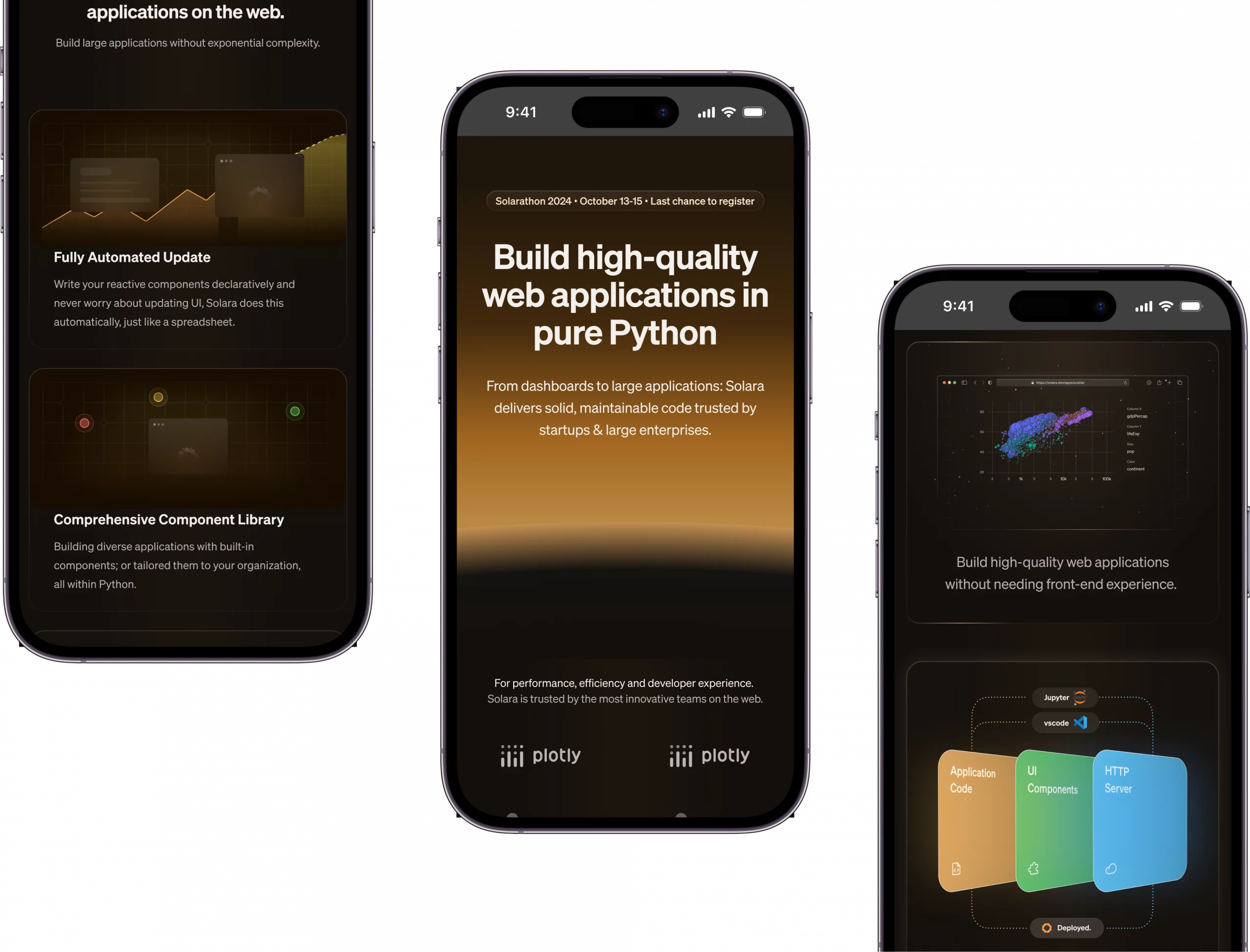
The current landing page , while effectively conveying a spatial theme, has a toy-like and unprofessional aesthetic.
To address this, I replaced the original toy-like spatial gadgets with a hyper-realistic animation of a sunrise in the hero section. This animation, inspired by the image of astronauts floating in space (Figure 3.2), elevated our visual identity while maintaining a professional look.
The iconic visual pattern
I collaborated closely with SWE to design and implement a card component hover motion concept, representative of sunrise.
By only adjusting fundamental opacity and colour properties, the animation was lightweight and implementable purely with CSS transform.